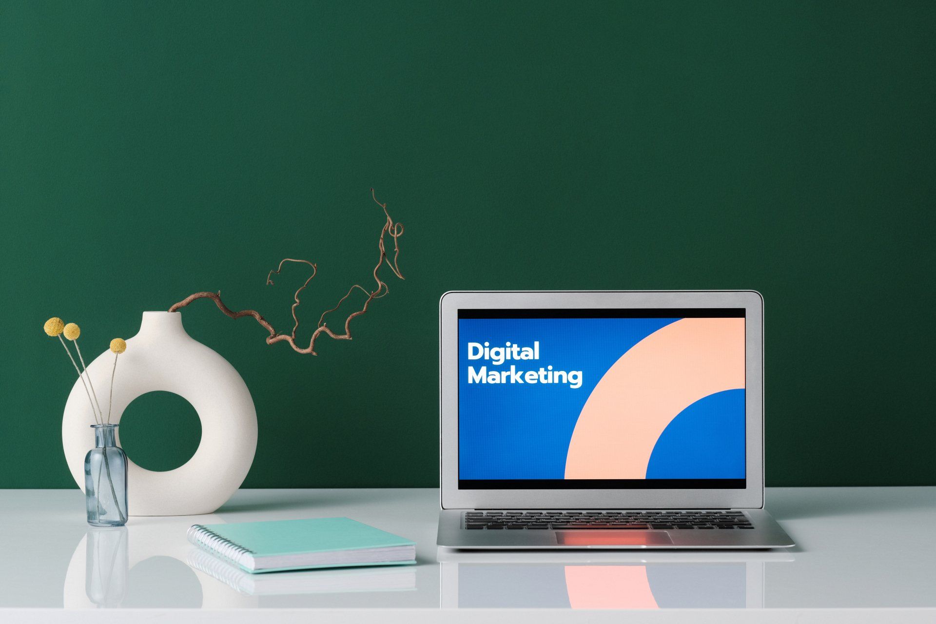
We Develop
Responsive Websites
Your website will look
GREAT on every screen and can be customized to only use the elements that are designed for the device your visitors are using. It's not magic but is an important element of your
digital success (OK - it's almost magic).
Responsive Web Design Benefits
Screen Responsive
Your site detects the visitors screen size and configures its images and content specifically for the screen.
Hide/Show Elements
Select the elements of a page are shown on each screen size ensuring an optimized page for each visitor.
Hide/Show Elements
Select the elements of a page are shown on each screen size ensuring an optimized page for each visitor.
Fast to Load
Every visitor, every device, gets what they are after fast and efficiently. Faster site, bigger success.
Responsive Website Design
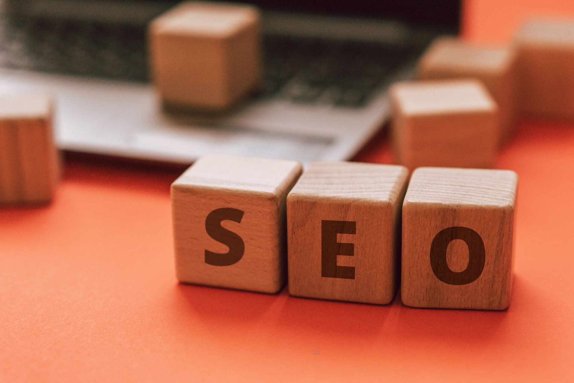
Effectively reach the widest audience by making sure your website looks great on every screen size. Importantly, the ability of your website to work well on mobile device browsers is critical to SEO Success.
Responsive Development is What We Do
Our design and development teams have responsive web in their DNA. From the planning of your website to the input of the last pixel we work toward optimal responsiveness.
Website Personalizations

What are Personalization?
By setting triggers for personalized elements, your site can dynamically adjust to each visitor's unique needs and preferences, creating a tailored experience that fosters engagement and conversion. That increases the likelihood that they will take action and become loyal customers.
Are Personalzations Unique?
With personalizations, visitors feel that the site they are visiting is uniquely relevant for them.
Why are they Valuable?
Personalizations increase conversions. They are easy to implement and help your sites stand out from the rest. A more unique user experience is more likely to result in your site's visitors converting to customers who return again and again.
What are the Limits?
We can create any kind of personalized experiences that you think will improve your site visitors’ experience and boost conversions
We LOVE to Help!
From Our Digital Success Blog